
Letterpress Practice
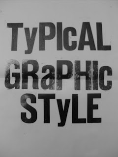
I think Letterpress will become one of my favourite mediums to communicate an idea, it is such a skilled process that takes patience. The consideration of space and colour is much more important compared to creating the image on screen. It is very difficult to determine the layout of an A3 design on a computer when its on a small screen. Initially i tried using metal type, it was very tricky to layout the text because it has to be upside down and you have to consider the kerning, tracking and leading. Alex (Letterpress Studio) suggested i start with metal as it is the most difficult and I would only get better at using it. Above is my attempt with wooden type, i found it so much easier to use. Noticeably their is a difference in quality - however 'Graphic' has a texture which was at first unintentional. I didn't re-ink the roller and this was the effect I created. It gives a dated effect, if it was consistant it may have worked visually.
No comments:
Post a Comment