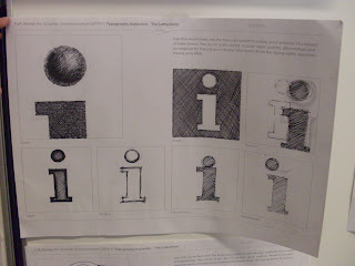
Learning about the history of type from Paul Bailey has really inspired me to make sure it becomes one of my strong skills. I learnt that throughout the ages symbols have been used to communicate and then through evolution developed in to what we now know as typefaces. Also the standard format for letter arrangement; baseline, x-height, cap height, ascender and descender guidelines.
We were given a task to express a type in a variety of ways, so we could analyse the style in depth and why it was different to another type. These are two examples from the workshop that I thought showed the best understanding and quality. Simply by tracing a letter and manipulating it allowed us to figure out the characteristics such as; brackets, serifs, crossbars and ascender/descenders.
I have always thought of typography as my favourite elements of graphics, in previous work I worked on the idea of what a typeface can convey put into a different context. Particularly noticing what thoughts and ideas are provoked. Below I used recognisable letters from logos to construct a demeaning idea of what the companies accidentally convey.


No comments:
Post a Comment